

Xstage
A new live streaming & entertainment experience
Role: UX/UI Designer
Duration: 8 weeks
Deliverables: Surveys, Persona, User flows, Wireframes, Style guide, High fidelity design, Prototype, Mockups
Tools: Adobe XD, Moqups, Lucid chart, Artboard Studio
Project Overview
Xstage is a multimedia sharing platform that allows users to engage in video media like never before. This app enables users to create & consume live performances, shows, stories, & photos from their favorite celebrities, creators or influencers. Additionally, Xstage makes it easier for users to create and share content with large audiences. It differs from other social media platforms in way of bringing the audience to the creators no matter how many followers a user has. The project started in the height of COVID 19 in 2020 and was cretaed by the founder Jean Roseme, who saw a need for live entertainment in its recent absence. We connected and after a few discovery sessions, we got to work. Overall, the project took 2 months to complete. My objective as the sole designer of the project was to help Jean develop his vision and implement a mobile first approach that aligns with his goals. Throughout the 2 months I was responsible for the creating surveys, persona’s, user journey’s and a few other deliverables I’ll be going over in this case study. We broke the project into 4 phases with a timeline of 2 weeks for each phase. The goal of this project was to produce an MVP for testing & development purposes.
Phase 1: Survey & Perosna
Phase 2: User flows & Wireframes
Phase 3: Style Guide & High fidelity Design
Phase 4: Prototype & Test
The Challenge
How do we create an experience that’s similar to a concert type atmosphere?
How do we maximize that experience on a mobile device?
What factors can we mimic from a live environment that will effectively translate to a viable mobile experience?
Surveys
Due to the budget and timeline set, there was little time for research. As I mentioned in the overview we spent a little over a week going over the concept, target demographics, and other details leading up to the opening project phase. There was useful information passed along in that week prior to starting the project but there was still info needed in order to narrow the scope. I crafted a couple surveys, one for creative/producing users and one for more consumer heavy users. Even though the app focuses more on the creator and distributing their content, I thought it would be important to get the perspective of the content consumer as well.
For the creator survey we wanted reveal the motivations as to why people create content. On the content consumer side we wanted to know what users like about the content they engage in and what experience factors draw them to other social media platforms. The goal of the surveys was to see what factors are important to users, what facets are they already used to, and potentially highlight areas Xstage can set itself apart from the commercial social media experience. Recruiting participants was challenging and I wasn’t able to recruit as many survey participants as I would’ve liked. But, I was able to recruit 8 consumer users & 1 creative user, with the original goal being 10 participants for creators & 10 for consumers. Each survey had 10 questions with questions varying from short sentences to option selections.
Insights
Majority of participants use social media for an hour on average daily.
The group was split between watching content a few times a day to a few times a week.
They like the ability to share content & experiences with their friends.
Pictures & video entertainment were the most preferred forms of media.
Prefer content that’s either informal or entertaining.
Some participants conveyed they didn’t like live streaming of social media platforms because they weren’t used to it.
The majority of all participants content consumption is taken up by pictures & videos.
Instagram, Twitter & Twitch were the preferred means of content distribution.
Content Creators like that they can get feedback from their followers.
Networking is important to creators when they are picking platforms to share their content on.
Would be open to having their content compared & rated with other content creators.
Creators like live streaming because it give them a chance to interact with their followers & viewers.
Moving Forward
The user surveys were helpful in figuring out what people prefer when it comes to content consumption. We confirmed that the social media experience is best when it’s indeed, social. People like the ability to share content with their friends or followers. There main platforms of choice were Instagram, Twitter, Twitch & Tiktok, which coincided with their favorite forms of media content, pictures & short videos. When it comes to the type of content, participants expressed a preference to informal & entertaining content as their favorite forms. Some participants like live streaming while the other half said they were either too busy or not used to it. The creator side was much different. Since I was only able to recruit one creator for the other side of the survey, we took these insights with a grain of salt. But most of his responses were along the lines of what we already thinking but the sample size is far too small to base any real decisions on. What we found interesting was his emphasis on networking. He conveyed that it was important for creators to have the ability to network with other creatives in their space. This participant happened to be a twitch streamer and produced engaging game conetnt for his followers. Although this app was intended for musicians & performers, I thought it would be important moving forward to make way for all content creators from various creative backgrounds to engage in the experience. We should make a product that welcomes not just musicians & entertainers, but creators like twitch streamers and youtuber’s as well. If we can host diverse & varying forms of content, then we will have a bigger pool of users that’ll be drawn to the app. Even tho our creator was a twitch streamer, after analyzing his responses we could see the similarities in needs between streamers and the more generic content creators in terms of content distribution.
Persona
We decided it was best if we moved forward with our ideal user archetype being a creative entertainer (musician, performer). So moving forward I crafted a persona that was more in line with Jeans vision. That archetype is a musician in his mid 30’s who’s the frontman of his band. Our persona lives in LA and his music is his livelihood. Because of COVID, him & his band have been struggling to generate any income due to lack of live shows. Ryan needs alternative outlets to promote his music on and continue to grow his following. Having a persona to create an experience around proved useful in shaping the experience.

User Goals
Creator
As a creator I want the ability to create content and instantly shared or be watched by users at an instance.
As a creator I want to use this platform to reach my fans and stream performances to audiences.
Consumer
As a consumer I want to watch live performances and be able to share the experience with other fans.
As a consumer I want to follow and engage in content that I’m interested in.

User Flow
User flows were created to help understand and anticipate cognitive patterns of users. Using lucid chart I started drafting diagrams of user flows with the goal of creating simple & direct interaction pathways. This process propagates low friction and helps us execute the ideal experience. It’s an important foundational piece on which the product is built around and can serve as a reference for other designers down the line. This tool helped us begin to determine how many screens would potentially be needed, what order they would appear, and what components need to be present in the design.

Wireframes
We wanted the interface to mostly revolve around the viewing experience, so I needed to play around with different options to see what layouts work best. Using basic shapes that represent screen elements like buttons, windows, banners, etc., I was able to mock up a few versions of our layout using Moqups, which is a browser tool for wireframes and other design related task. The approach we were going for was a minimal design but the amount of element Jean requested was going to make that challenging. We compromised in the form of assigning various of actions/features to just a few screen elements, that way we can maintain the experience were building while enhancing it through minimalism.
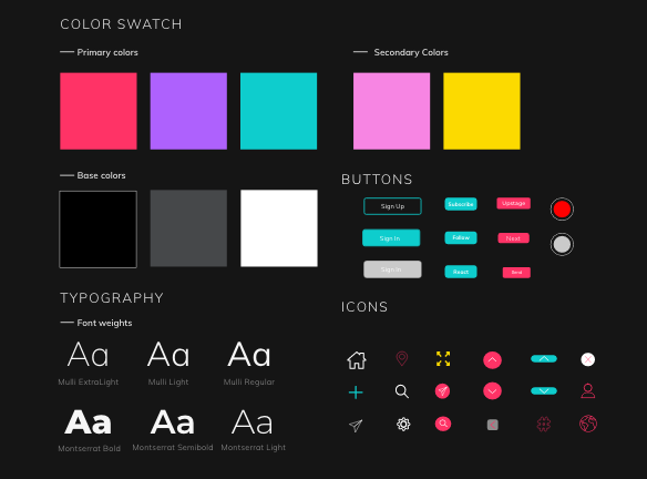
Style Guide
Jean requested the mood/experience to convey a club or concert type atmosphere. Vibrant colors that facilitate excitement and set the mood for our kind of experience. To the left are some samples of key elements, colors, and fonts that were used in the making of this MVP.
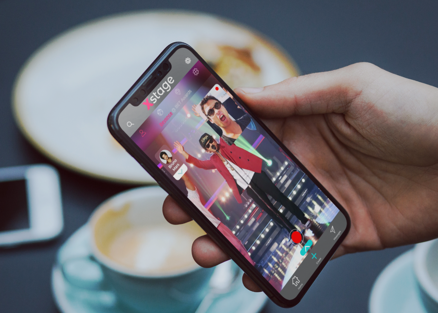
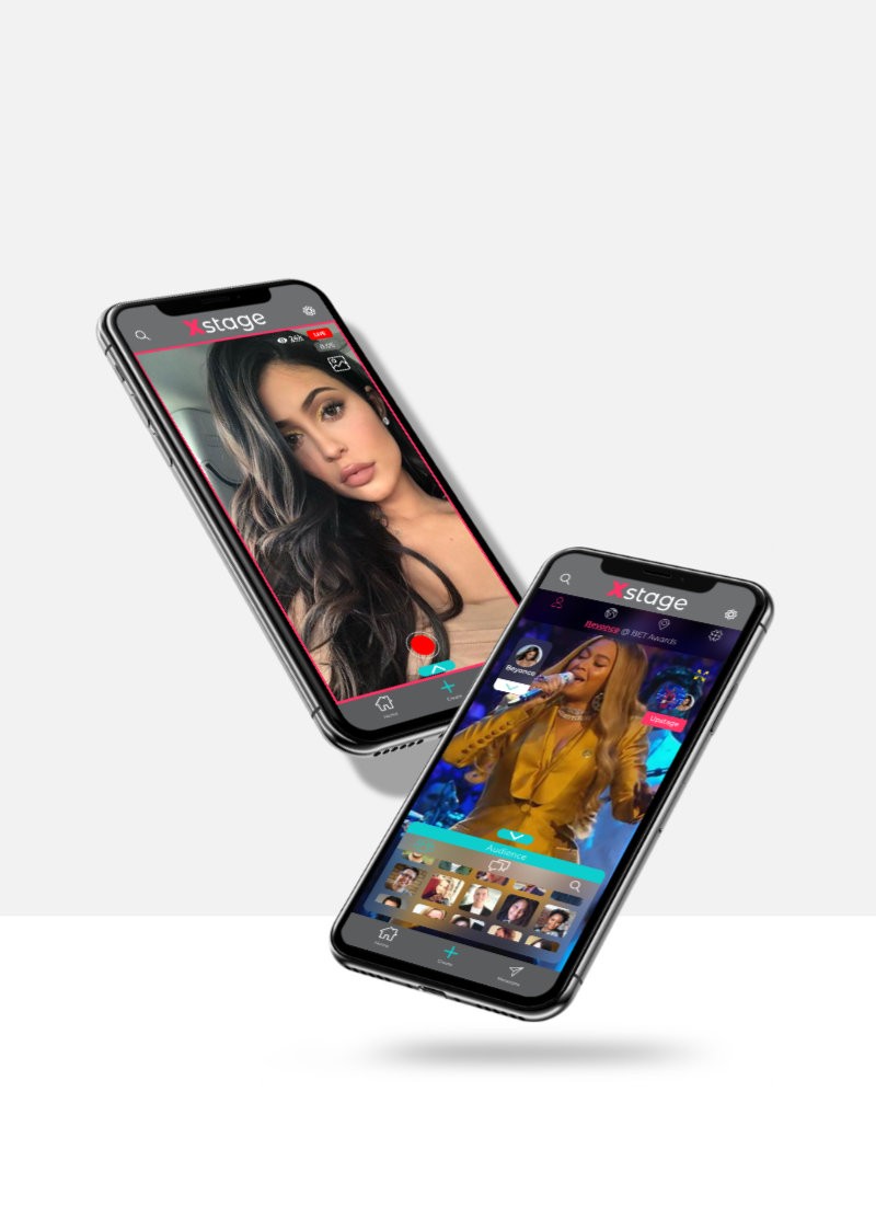
Final Design
Once the tentative style guide was serviceable & the wireframes were given the green light, I began to piece together the final design. On the consumer side, we wanted to create a concert like experience on a mobile device. With that in mind, it was important to maintain realistic expectations, we can’t bring physical conditions of a club or event to a phone. Theres some aspects we can’t recreate on a mobile device but there are other aspects that do cross over. By mimicking some of these we can bring on similar emotions of a live event. On the creator side, we had a list of features that we wanted to implement to give creators the capability to disseminate their content in ways that are familiar to them. The goal of this project was to produce an MVP for testing so I thought it would be best if we kept the dense creator features we were planning to implement on hold for the time being. Part of the reasoning for this was because we weren’t totally set on how we wanted to implement creator features because we didn’t have much information on them. Since there will be design sprints following this MVP creation, we will be circling back to the creative user feature set, pack on features that’ll add more depth and hopefully enhance the experience for creative users.

Usability Testing
Upon completion of our high fidelity design I created a prototype through Adobe XD to test our design with real users and gather some real feedback on our first functional design. I reached out to come of my fellow designers in my slack/discord communities and random customers at my local coffee shop for my usability participants. For this short test we created 4 task for participants to complete and a crucial part we needed insight on was how intuitive the flow was going to be. Xstage is different than its most competitors in a few ways but the biggest contrast is it gives consumers more ways to engage with content. We established the generic paths for engagement that are popular in many social media apps but some of the features like audiences & recording reactions isn't something thats being widely applied. For that reason we wanted to assure everything made sense and users could navigate the app with ease.
Task
Successfully sign up and get to the local stage.
Cue the audience tab and navigate to the subscribers view in the audience window.
Sign in and subscribe to a performer on the world stage.
Sign in and share content from the hashtag stage.
Insights & Next Steps
We found that our onboarding was a relatively simple process. Participants relayed positive feedback when they talked about the color scheme and UI elements but not the focus at this point. Some remarked that it gave off the feels of a club or a party like atmosphere. But there were some issues when users were asked to navigate to a certain stage. A couple users criticized some of the navigation elements saying they were too small and it took additional time to complete task. Another participant cited that we had too many steps for sharing content. Users want to be able to perform all tasks with minimal friction or steps. The more friction we have, the lower the completion rates for task which weakens the entire experience.
The overall insights gained were helpful. We found that our first task went well and users were able to successfully complete it. The second task, all participants completed but they had to do some trouble shooting to find the subscribe button. I think this issue could possibly be neutralized through a coached onboarding where we create slides showing how the app is suppose to work and where to find all of the key elements. In the third & fourth tasks users relayed that there were too many steps involved for whats usually a simple process. To neutralize this, I made a card instead of taking the users to a separate page but I think what will eventually happen in later iterations is we’ll have a condensed HUD that should allow us to put a couple more simple features like share buttons in plain sight for easier access.
At the time of conclusion of this MVP track, my founder & friend, Jean was looking for developers to build out whats been created so far and hopefully we’ll get into some actual product testing soon after late summer or early fall of 2021.